Concept for an installation designed to help guide a patient through the stress of getting an MRI. I know from personal experience that getting an MRI can be very scary when not properly educated on what to prepare for. The patient should be educated not only when they are in the machine but when they are prescribed it to begin with.
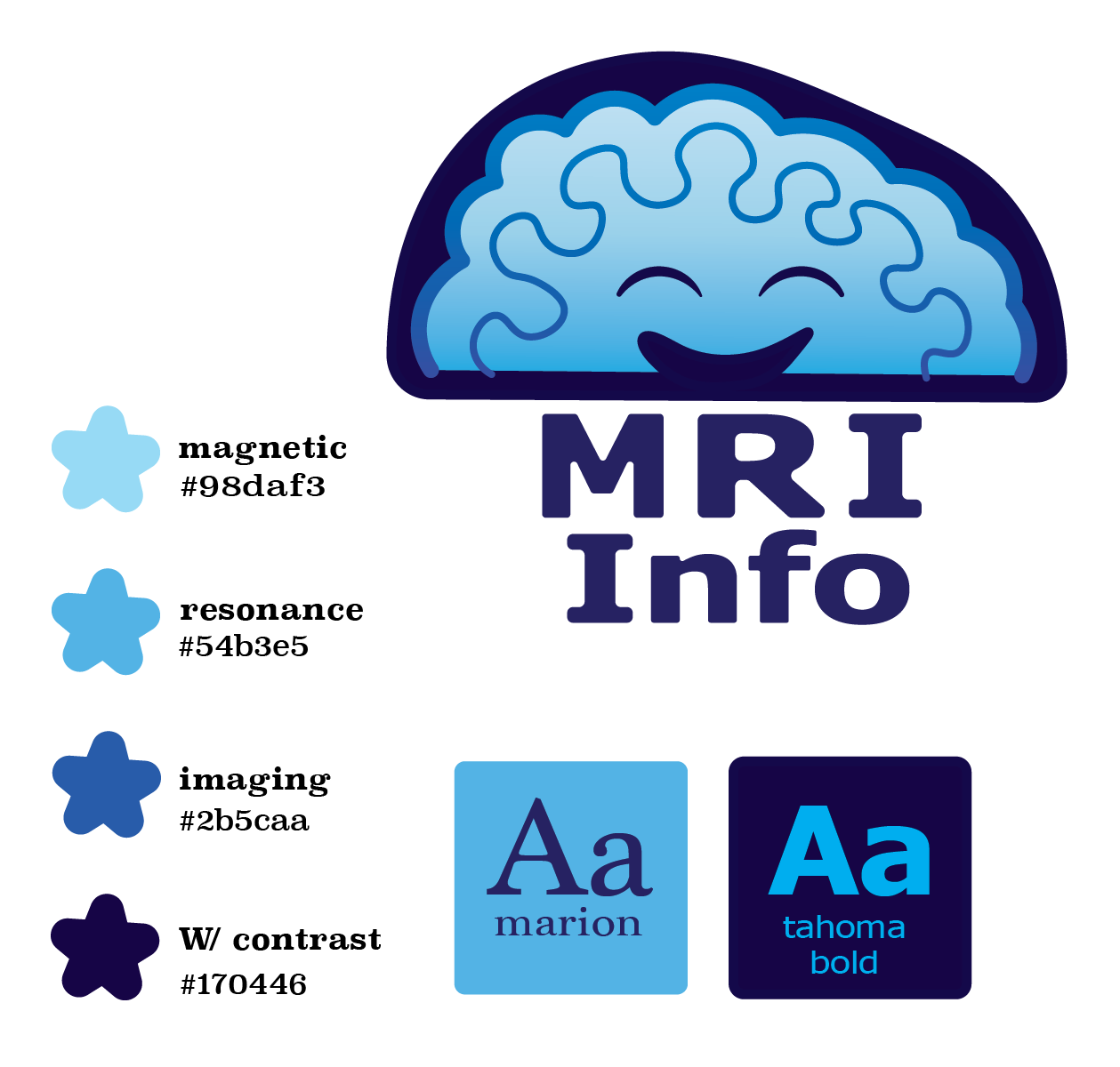
Step one was creating a nice calming color palette and logo.
For the logo, I was inspired by the brain, as it is what the MRI is primarily used to look at. I wanted it to be a soft, squishy friend that was going through this process with you- a reminder that you are safe.
Blue practically chose itself to be the main color. With its calming, natural effect and no troubling connotation, it was an easy choice. Even still, I had to make sure that the blue was warm and not cool. To choose a cool blue would indicate sadness and melancholy. A warm blue means a nice day at the beach. calm serenity
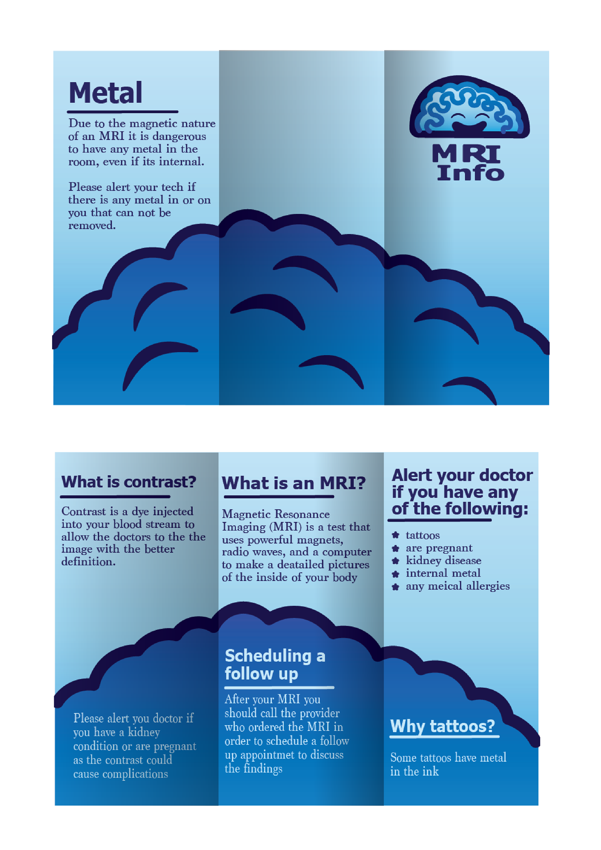
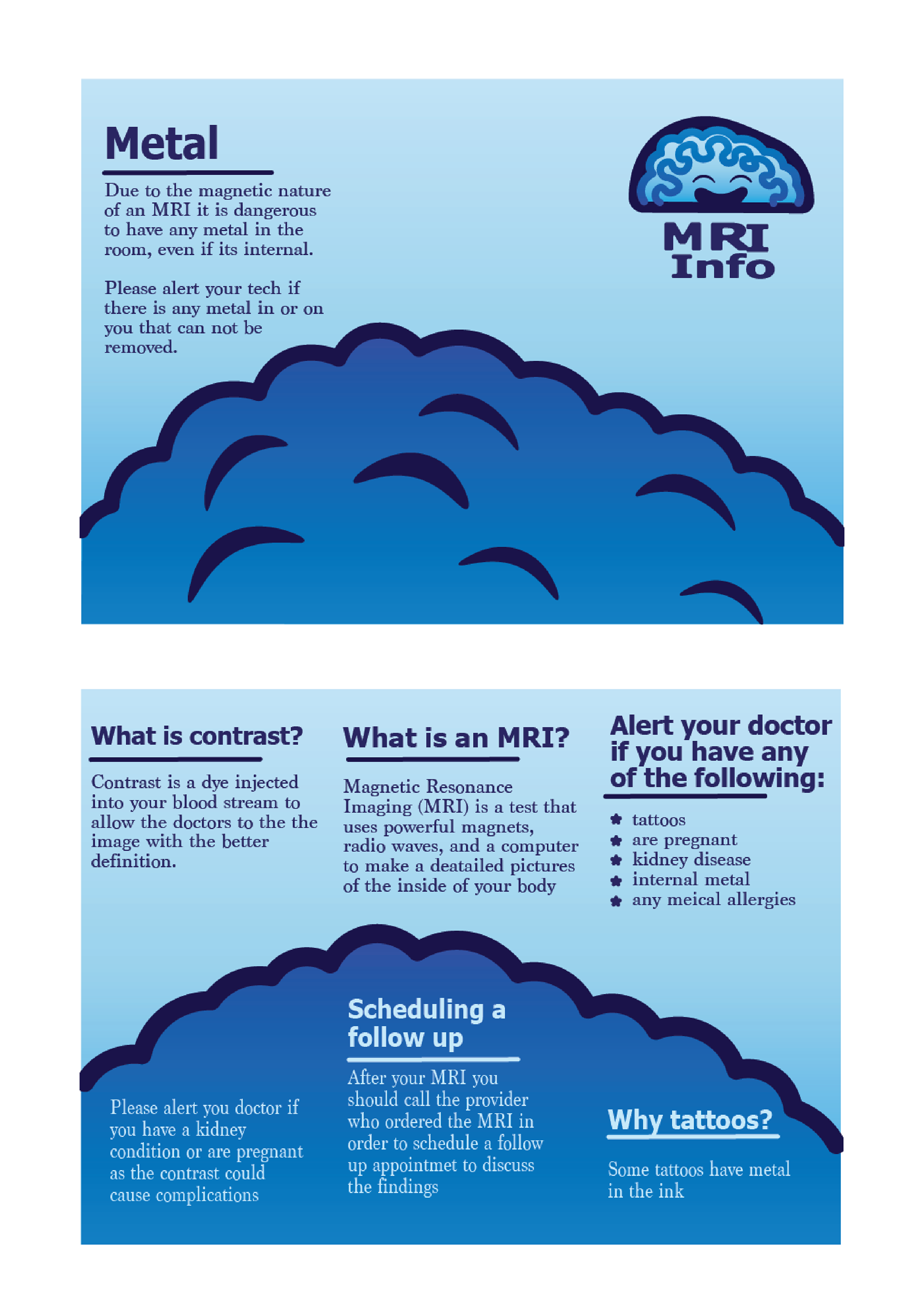
Here's where it starts for the patient: the take-home brochure. designed to be handed to them the day they schedule the test, allowing them ample time to read it and wrap their head around what's happening.
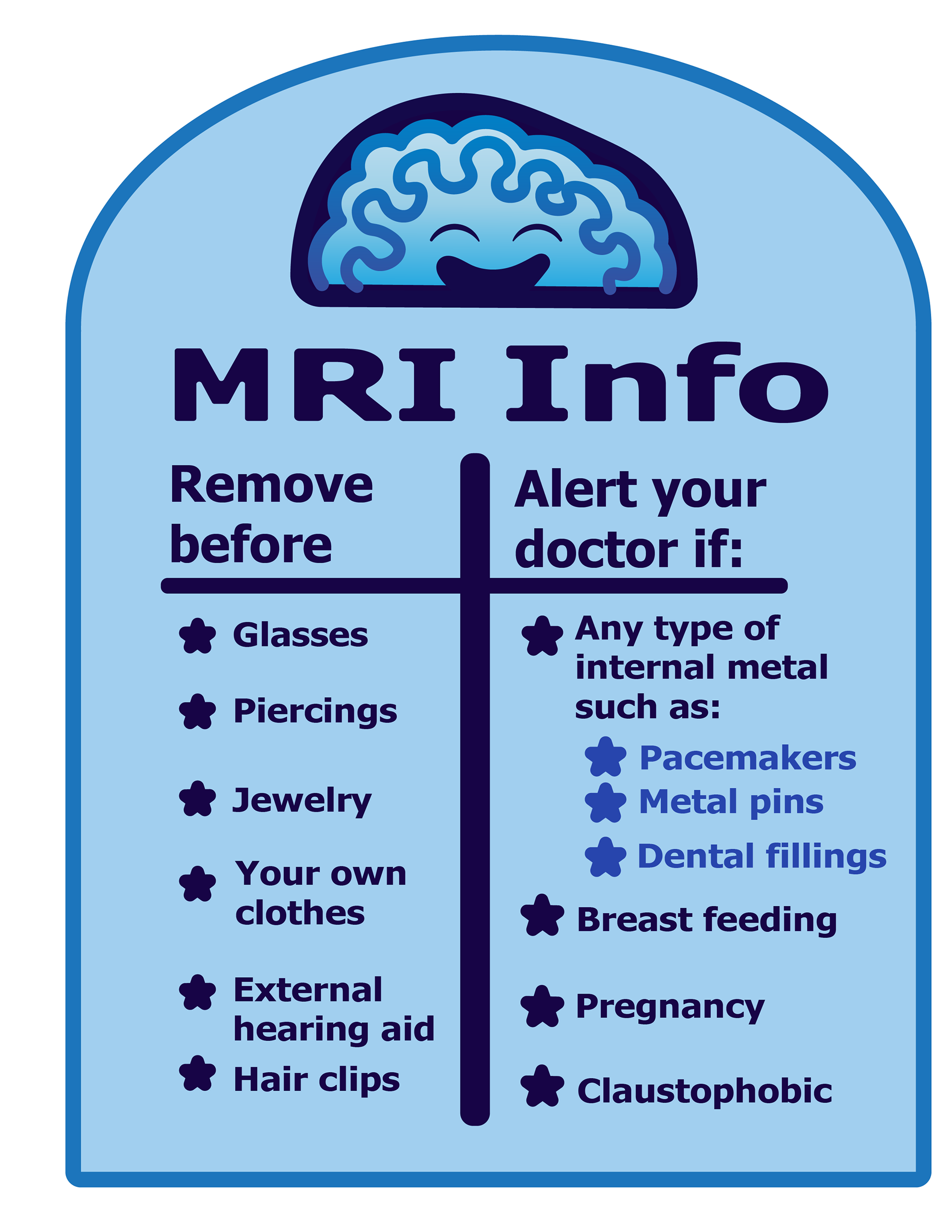
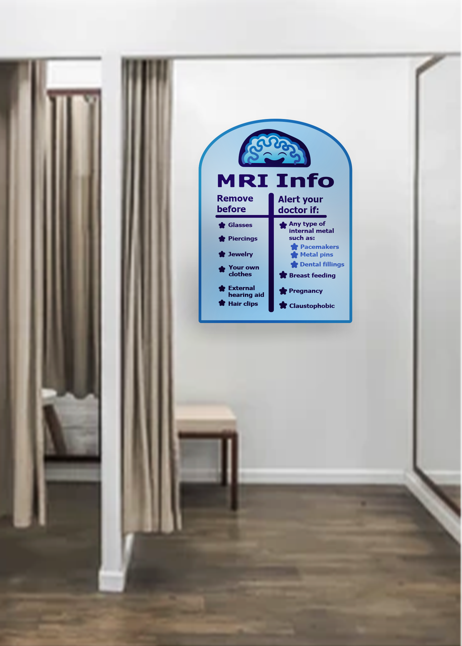
Last is the dressing room. The part where people will be the most nervous, double-checking and triple-checking that something catastrophic won't happen.
I have designed an installation for this moment to help relieve some of the anxiety. The installation gives a clear, calm, and concise overview of the do's and don'ts. I've always imagined it as an emotional handrail.


